In the following article, our objective is simple: to try and shed some light on how one can trade supply and demand on a chart. For those who are new to this concept, you may want to consider checking out this article before continuing as it provides a solid foundation: How to Identify Supply and Demand
Before we begin, we’d also like to remind our readers that technical supply and demand, much like every other technical method, will have losses. It does not matter which indicator you use to confirm a zone or what your favourite trading guru says, losses are a part of this business. It’s how you handle these losses that’ll define you as a trader.
Momentum from the zone.
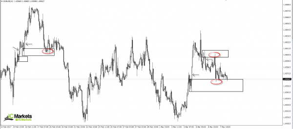
Ideally, when looking for supply and demand zones, you’ll want to choose areas that boast healthy momentum that have managed to take out nearby highs/lows. Why do we look for this? Well, quite simply, we’re looking for points on the chart that show price was able to move with little opposition.
On the chart below, we have marked four areas, each of which are displaying what we would consider to be a strong move (see black arrows).
Duration of time spent away from the zone.
Here is where we may differ from other supply and demand traders. We rarely select areas of supply and demand that show price has spent a long duration of time away from the zone. Of course, we have done this in the past but the results were average at best. So, what’s the difference between a newly formed area to a zone which has not been visited for say, a year?
To answer this question, let’s take a look at the logic behind these barriers. It is said that supply and demand zones work due to institutional traders leaving unfilled orders around the base of these areas. Now, if you were an institutional trader, would you really leave an open order in the market Empirically speaking, however, we have found that areas where price has NOT spent a long duration of time trading from its zone have been the more high-probability areas to trade.
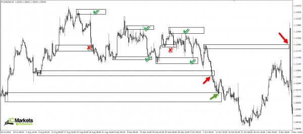
Take a look at the H4 chart below. One will be able to see that areas where price has spent a considerable time away from the zone (see arrows) did not fair too well. Now have a look at the ones which spent, at most, a week trading from the area. Out of seven, two failed.
Fresh!
This is a term we see getting thrown around trading forums a lot! Is the zone fresh? Whilst we believe there is no right and wrong in trading, here is our two cents’ worth on the subject…
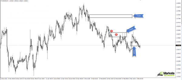
For us to label an area as fresh, two conditions need to be met. Firstly, the zone has to form on its own. It cannot be shaped from a reaction to another zone. Secondly, the base needs to fresh/untouched. We realise this may be a bit difficult to picture, so here’s a chart showing, what we’d consider to be, three fresh zones:
At point A, you’ll notice that the supply area did not form from a reaction to another supply zone above. And at point B, until price retested the base of course, it was fresh and untouched. Trading the first time back to these fresh hurdles has proven to be the most effective.
Trend direction
We’re sure that the majority of those reading this article have heard of the old adage: ‘the trend is you friend’. While we believe that trading with the trend is good, one also has to take into account that the market is fractal. Just because you see an uptrend on the H1, it does not mean that the daily timeframe, or even the H4 timeframe, will also be trending northbound. Therefore, we ideally want to see some confluence here. If the H1, H4 and daily timeframe show a trending market, the chance of a successful trade from a H1 supply or demand area greatly increases.
In addition to the above, it may be worth taking the time to study multi-timeframe analysis. Trading short from a supply zone on say, the a H1 timeframe, may look great according to your trend analysis. But if you fail to take into consideration what the higher-timeframe structure is doing, you may very well find that you’re selling into a daily demand base! And this is not somewhere you want to be placing sell orders, no matter what the trend direction is suggesting.
One needs to always check where they are on the bigger picture. If, for example, there are no higher-timeframe obstacles in your way and the overall trend is favourable, trading at nearby supply and demand zones have a much higher probability of working out.
In closing…
Should you look to implement some of the above said methods into your trading plan, your results will very likely improve!
Here are some other concepts traders may want to use to further confirm a zone of interest:
- Trendline convergence. Should a trendline converge with your chosen supply or demand zone, the odds of a bounce being seen is greatly enhanced.
- The approach. Is price forming an AB=CD Harmonic approach (we’ll cover this pattern in future articles), or a three-drive pattern?
- Is there a psychological handle or a long-term support/resistance level intersecting with your area?
There is a plethora of methods one can use to enhance the probability of a zone holding firm. Each individual is different and will therefore rarely look at the charts the same way. It is your job as a trader to find what works for you.


